Camelonta
Designing with accessibility in mind
I supported Camelonta in making products more accessible for their clients. My focus was on practical improvements in design and front-end, and on a simple workflow the team could continue using.
My contribution
- Conducted a quick WCAG review of key flows (Lighthouse/Axe + a manual keyboard pass).
- Produced an Accessibility Cheat Sheet for designers and developers.
- Improved component patterns: buttons/links; forms (labels, error messages, aria-live); dialogs (focus management, Esc); a skip link; and visible focus styles.
- Ensured color contrast and added tokens for states.
- Suggested simple checks in PR templates (e.g., “keyboard tested?”, “contrast checked?”).
Deliverables
- Sample code (focus ring, alt texts, aria-labels)
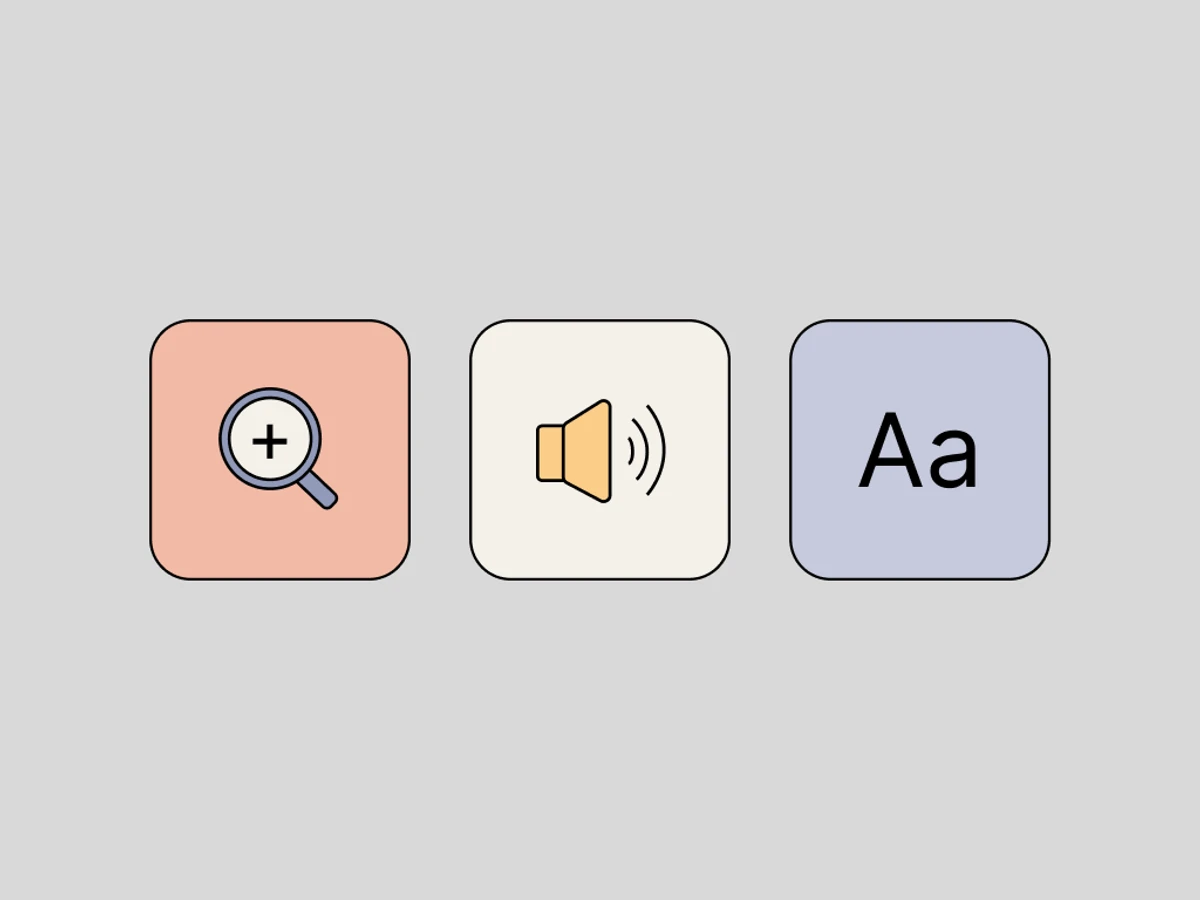
- Accessibility Cheat Sheet
Accessibility Cheat Sheet
-
Color & Contrast
✅ Text ≥ 4.5:1 (normal), 3:1 (large/bold).
✅ Focus states must be visible.
❌ Pure black on pure white due to potential overload (e.g. Irlen syndrome)./p>
❌ Red/green combinations (common in colour blindness).
Text & Readability
✅ Sans-serif for readability; accessible serifs also work.
✅ 50–75 characters per line.
✅ Base text at least 16px.
✅ Allow 200% zoom without layout breakage.
❌ Light grey text on white.
❌ Italics/ALL CAPS for long text (hard to read if you are dyslectic).
❌ Text smaller than 14px (absolute min 12px).
❌ Moving or flashing text.
-
Forms & Input Fields
✅ Label for each field (use <label> instead of placeholder text).
✅ Autofill and suggestions to reduce typing.
✅ Error messages should be clear and explain how to correct the error.
❌ Placeholder as the only label (disappears upon entry).
❌ Red text as the only error indicator – also use text or icons
-
Navigation & Interactivity
✅ Ensure that all interactive elements have clear focus indicators (e.g. blue border when tabbing)
✅ Use logical tab order – buttons and links should be accessible in the correct order.
✅ Implement ‘Skip to content’ links to skip repetitive sections.
✅ Support for voice control and alternative input methods.
❌ Small click areas or invisible buttons.
❌ Complex swipe and tap gestures with no alternatives.
-
Motion & Media
✅ Alt text: Descriptive but concise; avoid placing entire paragraphs in the alt text.
✅ Links: Use descriptive link text instead of generic phrases such as ‘Click here’.
✅ Subtitles on all videos.
✅ Text alternatives for audio (e.g. transcripts).
✅ Automatic pause function on moving content.
❌ Important information that is only shown in images.
❌ Avoid unnecessary animation.