Craft Bikes
Customizing mountain bikes

💭 Defining the Mission
Craft Bikes changes the landscape of mountain biking by offering a unique online platform where enthusiasts can design their dream bike by building it themselves.
Our mission: To offer a website for crafting unique and personalized mountain bikes.
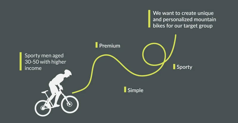
We began by conducting extensive research to create an experience map/road map of our target audience. Our focus was sporty people aged 30-50 years old with higher income, who are passionate about mountain biking.
Goal: Creating a Premium, Sporty, and User-Friendly website.
🔬 Market Research
The competitive analysis we did was to give us a clear picture of what similar websites exist and help us understand what our competitors are doing. We decided to research mountain biking websites where you can customize your bike. We identified the website's voice, brand, and tonality, how the navigation on the websites worked, the target audience for the mountain bike industry, the user journey, the website hierarchy, and if there were any functionalities or features that stood out.
Key Findings
- Some mountain biking websites offer a relatively straightforward user journey, although visibility indicators for the current page are lacking. Others have a complex user journey with numerous hover effects and distracting elements, which confuse users.
- Lack of clear navigation indicators, unclear visibility, and issues with text contrast affect readability. Overly busy interface, lack of descriptive text for images affecting accessibility, performance issues, unclear navigation.
- The hierarchical structure is overshadowed by cluttered design elements, making it challenging for users to find essential information easily.
- High-quality images showcasing trails and gear, custom bike builder tools, subscription options for newsletter, loyalty programs, 3D bike customization tools.
- Problems with contrast and lack of descriptive text for images, impacting users relying on screen readers to navigate the site.
- Slow loading times, due to large images.
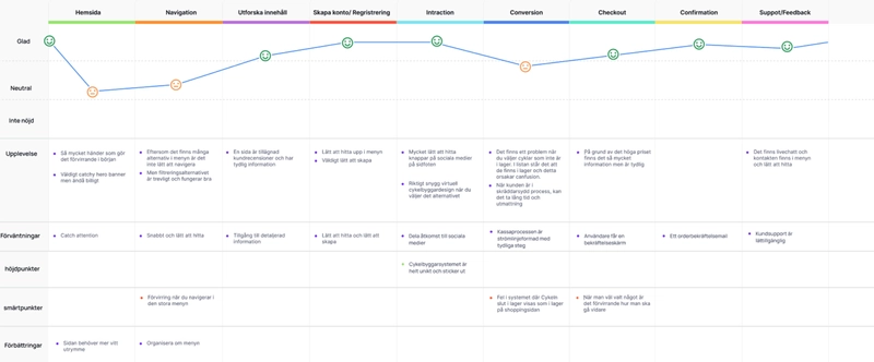
🔬 User Research
For our user research, we used qualitative methods such as interviews, we did 5 interviews each lasting approximately 15-20 minutes, conducted both in-person and online depending on participants' preferences. The interviews aimed to understand our target audience and identify behavioral patterns, focusing on individuals interested in purchasing mountain bikes online, our respondents were therefore people who had bought a mountain bike before.
Additionally, we conducted quantitative methods to gather facts about our target group, drawing information from sources such as Trafikverket, the National Cycling Report 2021, and an academic thesis titled "Swedish Mountain Biking: Challenging Traditional Norms. A Psychographic Exploration of New Target Audiences within Mountain Biking."
Key Insights
- Insights we had were to emphasize the importance of language precision and customized bicycle specifications to accommodate cyclists' needs based on factors like measurement, height and other details.
- Our quantitative data revealed that the majority of mountain bike riders fall within the 40–50 age bracket, with a median income of approximately 35,000–40,000 SEK or higher.
Identified Behavioral Types
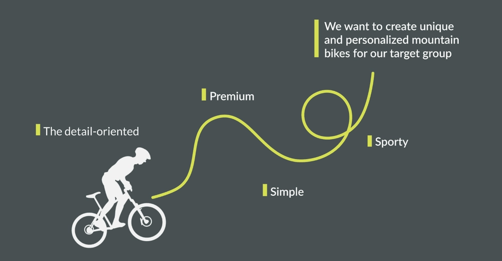
Based on our interviews, we developed five behavioral types. We reviewed our five behavioral types and found that they had similarities with each other, they did a lot of research before buying a bike and looked for functionality and quality in their purchases. Their motivations included "Best quality, to find good parts for the right price, and accessing information and expertise about the bike in the area." We narrowed down our behavioral types into a single archetype termed "The detail-oriented" with the motivation "best quality" and the behavior "research, expects good service"

We updated our roadmap:
🏗️ Lo-fi drawings
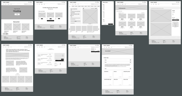
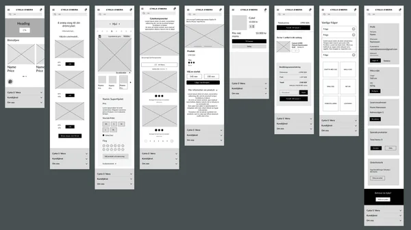
When we created our first wireframes we had our MVP, and road map in mind.
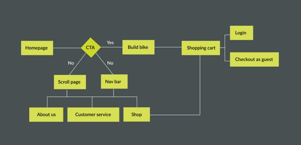
User flow-chart:
Lo-fi sketches:
📔 Brand Development
When we created our first wireframes we had our MVP, and road map in mind.
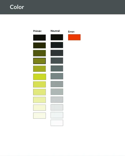
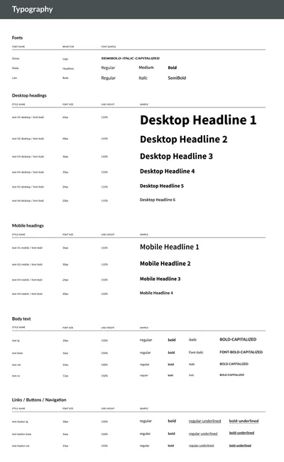
We encountered challenges in selecting colors that aligned with our goals of creating a sporty, premium, and simple design. Initially, we opted for an orange primary color and a dark blue secondary color. While orange evoked a sporty vibe, it unintentionally resembled an error message, and the dark blue, while premium, lacked the vibrancy we sought. Feedback from a preference test reinforced the need for a change.
Enter "Grellow" – our solution to strike a balance. However, achieving WCAG approval posed another hurdle. Experimenting with darker shades of green didn't resonate with our desired sporty aesthetic, and external feedback echoed this sentiment. Fortunately, we discovered that adding a thin black stroke around the Grellow elements ensured WCAG compliance. This revelation enabled us to maintain our desired color scheme while meeting accessibility standards.
Throughout this process, our design ethos remained rooted in simplicity, evident in clean layouts, intuitive navigation, and minimalist elements. This approach ensured that our design not only looked sleek and premium but also remained accessible and user-friendly, embodying the essence of our brand.
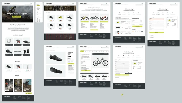
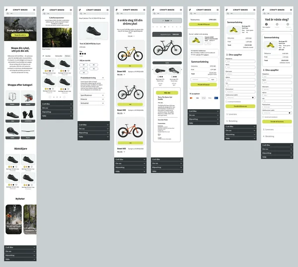
🏗️ Wireframes
💻 User Testing
We conducted usability testing on the "Build Your Bike" flow with the aim of gathering feedback to enhance the user experience for our customers. Our primary objectives were to assess whether the "Build Your Bike" tool conveys a sense of sportiness, premium quality, and simplicity tailored to our target audience, the detail-oriented users.
We chose to do controlled observation tests to understand how our target audience, the detail-oriented users, interacted with the bike-building tool and to generate ideas for improvement.
Test Participants
Observation tests were conducted with a group of 6 individuals who represent our target audience. These participants were specifically selected for their detail-oriented nature. We reached out to individuals who had previously participated in interviews during our User Research phase to ensure alignment with our target demographic.
Key Findings
Based on our user tests, the general feedback we received was that it was not perceived as particularly sporty, the green color felt sporty but users would have liked to see a more sporty personality in the choice of font, in the interface, and sporty images/videos.
Some of our interviewees perceived the site as premium. What was highlighted as premium was the serious feel of the site, with the color scheme and design helping to create credibility. Those who did not consider it premium mainly thought that there was a lack of correct information on the cards and images and that some components did not match the design of the bike, but also to get a more premium personality in the design of the site.
All our interviewees thought the site was very clear and simple. One of our interviewees said that she could rely on the website to guide her and that it was easy to go back in the process, which saved a lot of time. Another found it easy to build their bike for the customer. And a third described the steps as simple but that they could be clearer, with the possibility of improving the clarity and overview of selectable components in each category.
What Users Liked
- Users like that the category they were in had a clear frame on the image for the specific part.
- User-friendly and simple.
- Liked that you know which part of the feature you are on during the build process.
- Liked the overview to be able to see details of your product.
- A uniform design, good layout.
Suggested Improvements
- The navigation menu and the CTA button say different things, it should say the same thing so you know it goes to the same page.
- Change "Build your bike in 8 steps" to a shorter and lighter text. Increase visibility on small screen readers of the "bike cards" and bike models to avoid the need to scroll to select a bike model.
- Difficult to compare the bikes. More information that tells you why a specific model suits you. What do I want to do with my bike, what level? One test person came up with the idea of being able to take a quiz to find the right model.
- Clearer overview of the options for each part of the bike. Solve so that when you change parts you do not have to jump back up the page as it feels disturbing to our test subjects. As much info on the same page as possible, preferably to see all the choices you have at the same time.
- More choices and that all information is updated correctly, info in the cards and prices etc.
- Change the like button to save to make it clear that the information is saved. Clarify where the cycle is saved when the like button is used and whether it is the whole or part of the cycle that is saved.
- The users thought it would have been good to have a comparison service, as they wanted to be able to have the parts up at the same time to be able to compare them with each other.
- Provide more information on the different types of insurance.